

How an engagement runs
- 01
Understand the job
Interviews, current-product review, and success metrics for the flows that matter most this quarter.
- 02
Explore and validate
Flows, wireframes, and clickable prototypes tested with real tasks before visual polish locks in.
- 03
Systematize the UI
High-fidelity screens plus a component library so new features reuse patterns instead of inventing them.
- 04
Support the build
Engineering handoff, QA against design, and iteration after launch based on what users actually do.
When does product UI need design that ships?
UI/UX design services improve how people understand and complete tasks in a digital product. Work usually includes research, user flows, wireframes, prototypes, interface design, and reusable components. It fits products with confusing journeys, inconsistent screens, repeated support questions, weak handoff, or design debt that slows engineering.
Help lands before a build, during a redesign, and when you are productizing an internal tool for paying customers. The goal is clarity: what the user is trying to do, what stands in the way, and what the interface should do about it. This is not a brand-only shop that disappears after a mood board. Designers work next to the people writing the React and Flutter code.
Come when onboarding leaks, checkout stalls, admin tools punish power users, or mobile and web feel like two different products. Analytics or support themes get used when you have them. When you do not, real tasks still come first, not guesswork framed as vision.
What does a UI/UX engagement include?
Outputs include user flows, wireframes, high-fidelity UI, interactive prototypes, and design systems with components, tokens, and usage rules. For mobile and web, patterns stay aligned so your SaaS or consumer app does not feel taped together. Empty states, errors, and loading behavior get designed on purpose. If support already has a short list of confusing screens, that list becomes the first backlog.
Critical journeys such as onboarding, checkout, search, and admin bulk actions get redesigned where small clarity gains show up in completion rates. Editorial catalog work like Loom & Luxe and social discovery work like Gusto both need density, hierarchy, and media that still feel fast. Those constraints shape the design instead of pretending every screen is a marketing landing page.
When you want the same partner through build, design continues into implementation reviews so spacing, states, and edge cases survive contact with real APIs and device sizes.
How do you deliver UI/UX work?
Research starts light but real: stakeholder interviews, analytics review when you have it, and task-based looks at the current product. Prototypes get tested before a full sprint goes into the wrong interaction. Critiques happen in Figma with your PM and tech lead in the loop.
Handoff comes with specs engineers accept. Sprint reviews catch drift early, and designs adjust when technical constraints force a change. At any point you know what is validated, what is still exploratory, and what is ready to build this sprint. Open questions stay listed in the file so they do not hide in Slack threads.
When scope pressure hits, cuts follow user risk, not deleting every empty state. A thinner first release still needs recoverable errors, clear next steps, and components that will not fight the next feature. That is how redesigns stay shippable instead of becoming endless exploration.
What tools and practices do you use for design?
Figma is the source of truth. Libraries get structured for reuse, empty states and errors get documented, and accessibility targets get set with you. Storybook or similar component previews help when engineering wants living examples beside the design file.
Visual direction follows your brand when it exists. When it does not, a restrained system gets defined that can grow without reinventing buttons every quarter. Decorative noise that fights the job gets cut. Density matches the domain: ops tools get denser; browse and discovery get more breathing room. Motion, if used, supports orientation and feedback, not decoration for its own sake.
Which products need this design work?
SaaS dashboards, e-commerce and rental browse flows, hospitality discovery, edtech assessment UI, and logistics ops tools are familiar ground. Each has different density and stakes. Design follows the job, not a generic template reused across every pitch deck. Tired, interrupted, or field-phone users shape the UI more than a trend does.
Related case studies: Loom & Luxe, Gusto.
Why hire Algo Vortex for UI/UX?
Teams pick Algo Vortex when design has to survive contact with engineering reality. Pretty screens that ignore API limits help nobody. Designers here understand product trade-offs and can sit in the same planning meetings as your PM and tech lead.
US, UK, UAE, and other international product teams get overlap hours and async critique. Engagements can be design-only, design-plus-build, staff-augmented product design, or part of a wider dedicated team. See the interface work in Loom & Luxe, then contact us with the flows that hurt most.
Technologies we use
Stack
- Figma
- FigJam
- Adobe Illustrator
- React
- Next.js
- Flutter
- Storybook
- Zeplin
Common industries
- SaaS
- E-commerce
- Hospitality
- EdTech
- Fintech
- Healthcare
Proof
Related case studies
Live products where this capability showed up in the build.
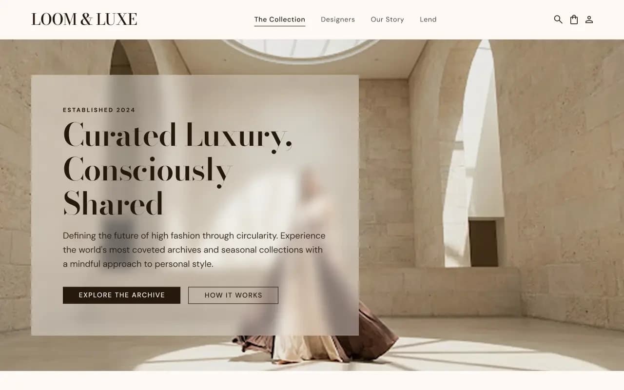
Editorial catalog with Stripe holds and automated return pickup. Lender dashboard keeps inventory and earnings honest for both sides.
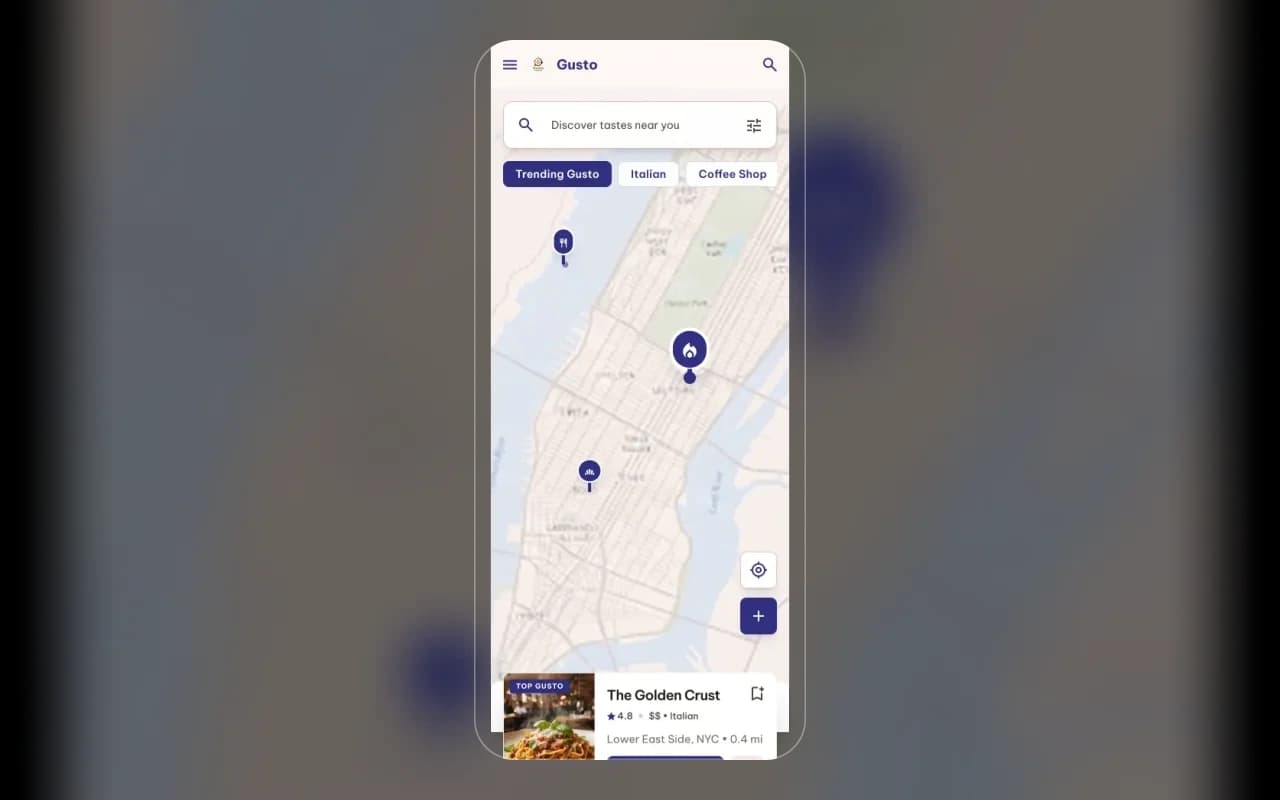
Map-first restaurant discovery with friend posts and dish photos. Social proof you can inspect instead of another cold star wall.
Capabilities
Related capabilities
Web & Mobile Development
React, Next.js, Flutter, or React Native apps fast enough for daily use and solid enough to grow.
Custom Software Development
From discovery through production releases, we build the systems your business actually runs on.
Digital Strategy & Consulting
Workshops and roadmaps when you need a clear engineering plan before you grow the team.
FAQ
Questions about this service
More engagement and IP questions live on the FAQ page. For a lasting dedicated unit, read the Offshore Development Center guide. Ready to talk? Contact Algo Vortex.